BLOGGER TEMPLATES AND TWITTER BACKGROUNDS »

Sunday, November 22, 2009

Choosing a Color

Choosing the correct color pallet for a product/brand is an essential process when designing for a company. Each color tells a different story. A designer must know very well what the product or brand is trying to sell in order to pick the correct colors. For instance, when we see gold or silver we link it to royalty and elegance. When we see brown we think of soil and nature. It is very important to choose the correct colors because those colors will represent the product or brand. Colors do have a major influence on consumers.


The Starbucks logo has the color green. Green representing the environment and organic. The image of Starbucks has always been very organic and "green" so the color choice suits the brand's image very well. And when we see the products that are being sold at Starbucks, we mostly see the colors brown, green, and other soothing colors that represent nature. That's the image Starbucks is wanting to sell.

McDonald's colors are mainly red and yellow. We can recognize the sign from a very far distance that this is a McDonald's logo. The colors red and yellow are two very lively colors, usually representing the sun. But red and yellow can also trigger hunger. When we see the signs we immediately think of food due to the color choice. The same with other fast food chains, the mostly include red and yellow in their logos. For example, Carls Jr., Burger King, Jack in the Box, etc. Different genres uses different color choices.

Each color represents different ideas. They all link back to our normal lives and can relate to our daily habits. Designs from advertisements can most likely find colors to be of great help to the design process and can be much more appealing to consumers.

Sustainable Design --- Nathan Shedroff

Guest speaker Nathan Shedroff gave a thorough presentation on sustainable innovation. In the very beginning he explains that Design, Sustainability, and Business all connect with each other. When put together, makes meaning and experience in all fields. Many questions arouse from sustainability. What is a more sustainable world look like? What is a more meaningful world look like? What is a post-consumer world look like? All these questions yet we do not have an answer. But we need to. And that is what design is for, to create answers to all these unanswerable questions. A sustainable design also has to consider multiple factors such as financial, social, and ecological factors.

As we saw in Nathan Shedroff's presentation:
"In a stable economy, sustainability is the competitive advantage strategy. In a down economy, sustainability is the turnaround strategy. In a collapse, sustainability is a survival strategy." Hunter Lovins, 2009

There is no such thing as sustainable design. But there is such thing as more sustainable design. "Don't design things today that make tomorrow worse."


We always go back to the iphone because it was such a successful sustainable design. It's fashionable, some what "affordable", it's portable, and it can substitute as a phone, mp3 player, camera, watch, GPS, planner, etc. Instead of bringing 5 billion different devices, we only need one iphone to substitute it all.

Saturday, November 21, 2009

OBJECTIFIED


The film Objectified showed many industrial designers from around the world. To paraphrase all their messages together: "Industrial designs' goal is to produce mass production." Which is true, the whole goal of industrial design is to produce copies of their designs and send them out to the world. Every design has a meaning behind it. Every design tells a story. As stated by the film, a good design is innovative, honest, consistent in every design, and should have as little design as possible. Design is to search for form.

What does it meant to search for form? A design with form will drive consumers to buy that design. It could be the way it looks, how useful it is, if it's comfortable, etc.

The film talks a lot about industrial designs and the processes of making each objects. The process of designing each object mainly focuses on what the consumers want and what the consumers need. For instance, the grip handle on the cutting utensils. They first marked down all the pressure points that were used when using the utensils. They went through a process of producing different grip handles to test out to see if it satisfied their initial goal.

Design today needs to think of the consumers' wants and needs in order to produce a successful design. Because in society today, many objects that are sold today depends on supply and demand of the consumers. Take the ipod/iphone for example, why is their product so successful in the market? Because it is innovative, people can afford it, there are many choices for different age groups, and they have everything you need in one little gadget. No wonder the Apple company is on top of the list!

picture from apple.com

Friday, November 20, 2009

Abstract Art

What is abstract art? If asked, many people would say, "art that's kinda random...", "confusing, no true meaning behind it." Is that true? Is abstract art "random"? "no meaning"? The answer is no, it's not true. Many abstract art are well planned and intended to be that way. They all have a meaning behind it. Abstraction indicates a departure from reality in depiction of imagery in art. An example of a very famous abstract artist is Piet Mondrian. His most recognized works are abstract paintings of colored squares, rectangles, and thick black lines. He began all is paintings in a grid-like format, coloring squares and rectangles in mostly solid colors.
This painting of squares and rectangles have already been evolved several times before it finally looked like this. His most famous works are painted primarily with the colors red, yellow, and blue, as well as black and white. In this version of the piece we see the used of double and triple lines in which he had never used before. And then led to another major adjustment to his piece. Mondrian painted smaller squares between several lines without any black bounding their edges. Throughout the different adjustments of his pieces, we can see a change in direction in his life that reflects in his paintings.

We may not be able to find the true meaning behind each painting, only the painter itself knows. But from these abstract paintings we do see that each line and color was as intentional as modern design we see today. Abstraction is just another way to escape reality and express emotions in a very different way. Even today, artists and designers use abstraction to achieve the utopian world they long to strive for.

Color Theory by Albers


In the book Interaction of Colors by Josef Albers, it mentions several times that "color is the most relative medium in art." As Albers stated in one of the chapters of his book, different people have different perception of the same color. For instance, if fifty people were to pick out the color "green", there would most likely be fifty different shades of green that we
re picked out. Albers used this example to prove that it is close to impossible to remember distinct colors. He underlines the important fact that "the visual memory is very poor in comparison with our auditory memory." Albers often compares colors with poetry and music. He stated "colors and hues are defined, as are tones in music, by wave lengths."

Lets look at one of the plates from the book:

Colors can be very deceiving. It is very difficult to single out a color by itself and not seeing them as an interaction with the surroundings. In this picture, we know that both grids in the middle are the exact same shades of green. But why does our eyes see differently. This is the magic of colors, they can be deceiving. The background color changes from yellow to a darker color. The green is interacting with the background color in which it was placed on. Each color influences the green differently and that is why we see the green grid to appear so different from each other when in fact it is the same.


Another color deceiving image here. In our minds we see four different colored squares with a folded transparent square on top. The transparent square is nothing but different shades of colors put on top of the original colors. It works as a transparent square because it interacted with its surrounding colors and created the effect in which our mind perceives it as a transparent square instead of different shades of colors.

Design today manipulates colors to "deceive" our minds. Make up is a great example of color deceiving. Different shades of eye shadows work against the different shades of skin colors creating different effects with the eyes.


Picture from lancome.co.uk

Thursday, November 19, 2009

REPETITION repetition


As we've learned in the Gestalt Theories, repetition can be one of the elements that creates unity within a design. The concept of repetition sounds simple, but knowing how to use it correctly requires further knowledge of the concept.

If each object repeated itself identically throughout the whole design, the design would be very "boring", it wouldn't be able to capture the viewers' eye
s right away. To create a successful design using repetition, objects in the design should be repeated with different angles, different colors, different sizes, etc. That way, the viewers' eyes can flow in and out of the piece thinking, "Hmmm...this object looks familiar but different at the same time." The more they think about the design the more successful that design is.

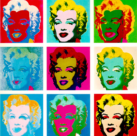
Lets take a look at Andy Warhol's famous pop art of Marilyn Monroe.
Even though the image of Marilyn Monroe doesn't change throughout the grids, the color change creates that unity that connects all the grids together. The different colors represent different moods in each grid, being able to capture the essence of the whole design.

Now lets take a look at a more complicated piece of artwork.
This is also a grid design, but notice how the object is not the same in each grid. However repetition still takes place in this design. Notice in different grids, the shapes and lines repeats throughout each grid.

Many designs in society today use this technique to create "unity", for instance, many commercial advertisements uses repetition. We see that the graphics on gift cards repeats itself. Repetition can be a great technique to designers, if known to use it correctly.

Sunday, November 1, 2009

IMAGINE NATION

Design revolves around our imaginations, or "thinking outside the box". New designs need to pop out and "wow" the audience. Make them have a second look and have them think about the designs. The more "different" the design is from other designs, the more we tend to stare at the design and go "hmmm...what does this design mean?" The more people staring/thinking at your design, the more "successful" your design is.


picture from: xcitefun.net

As we look at this picture, we find it fascinating that this picture seems so REAL! The tearing up of the artwork serves as a rhythm to flow the viewers' eyes in and out of the drawing. The creativity of this piece "wowed" me the first time i saw it. Having the person in the drawing taping back the torn up drawing is ingenious. This is "thinking outside the box!"

Designers/artists manipulate this "wow factor" in order to capture attention. In order to find this "wow factor" they have to use their imaginations and create different/unique projects for the audience to go "WOW! that is awesome! I would've never thought of that!" We live in a world where all kinds of imaginations are possible, or what I like to call it, the Imagine Nation.


HA PPYS LI P :)

When we were watching the video of happyslip in class, I was fascinated with the humor and how "right" she is with the advertisement on the home security infomercial. Her videos can be easily related because she involves REAL PEOPLE in her videos.

When she was in class the other day, she talked a lot about feedback and networking. As a creative designer, we must learn from feedbacks from others, positive and negative. Negative feedbacks are what helps a designer improve on his/her projects. Networking helps broaden a designer's circumference of people to make his/her work universal. Christine Gambito talked about viral marketing and how it helped her get to where she is now.

One more thing she emphasized about was: as a creative artist, one must find inspirations from anywhere and everywhere. Find creativity outside of yourselves. Be "unfashionable" as Housefield says. Do what you want to do and don't have people stop you from doing it. That's what happyslip is about. That's what design is about.

picture taken from: http://www.chareyes.com/blog/2009/03/22/happyslip/