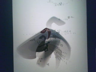
Dream of a Goose
Phil Choo uses shapes and lines to create the figure of a goose, he didn't just draw out a goose, he used different shapes and colors to create a goose figure. He also uses typography to create lines and space around the goose. The typography in the design helps balance out the picture; it creates positive and negative space throughout the whole canvas. The typography ties the whole design together with the goose in the middle.
Compared to other designers, Phil Choo tends to base his designs on typography of Korean characters and non-recognizable shapes. After putting all the elements together, a goose comes out of the picture.
According to the lyrics to the song, the design is supposed to illustrate the idea of dreams intimidated by reality. “The goose in the middle implies that the big bird is flying over barriers.”
Design today tends to lean on simplicity and abstract drawings. Design evolved throughout time based on the interpretations of design from different generations. Many designers now involve typography art as part of their designs.


0 comments:
Post a Comment