BLOGGER TEMPLATES AND TWITTER BACKGROUNDS »

Saturday, October 31, 2009


As we look at the quilts that were being displayed in the Nelson Art Gallery, we see a similarity in all the quilts. They all have a sense of pattern and rhythm.


Lets take the far right blue quilt for example. We see a repetition of pattern throughout the quilt. The pattern repeats itself in different directions and with different shades of color, forming a rhythm in the quilt. The rhythmic pattern emphasizes the color contrast between each stripes in each directions.


For this quilt, there are two different patterns. The outer "border" repeats with different thickness of lines. The outside squares captures the importance of the inner squares because there is a huge color contrast between the two. The four squares in the center of the quilt ultimately have the same pattern throughout, but they are all filled with different colors. These four squares are the staccatos of this design.

Design today also manipulates patterns and rhythms to establish and emotional response in the viewers.

picture from: kaboodle.com

The shirt uses repeated patterns and vibrant colors for their design.

Sunday, October 25, 2009

OLD versus NEW

Why is that the designs from previous centuries are so much different than the designs now? There are many answers to that questions, but for now we will discuss only a few.


Technology. The new and improved technology allows us to move further with designing a graphic, product, space, architecture, etc. Back then, all designs were hand-drawn or were from very limited technological resources. Now we have multiples of applications in our computers to help make the process easier and less tedious. These applications include illustrator, photoshop, indesign, etc.

The change in demand. People back then and people now want different things. They view things differently. This can also be called "generation gap". Design has evolved to fit the wants and needs of current issues. Just like how businessmen have to think of supply and demands of consumers, as designers we also have to think of our clients and audiences. We want to make things appeal to as much people as we can.

Three D

Three dimensional designs are different than two dimensional designs. Not just the fact that they are different dimensions, but they have different perspectives on how to view the designs. When designing a three dimensional object, we have to follow the rule of two/three point perspectives. There is always a horizon line and a vanishing point.


Buildings are examples of 3D designs. Architects spend most amount of time focusing on the perspectives of the design. What can capture the viewers' eyes and be stable for the design to be created.

The Gestalt theory says that proximity, repetition, and continuity can create unity in a design. Most successful designs we see today have used these elements in their designs to capture audiences. Most, if not all, commercial designers work hard to achieve the balance between these elements of unity.

Friday, October 23, 2009

Gestalt Theory

2D DESIGNS

The Gestalt theory focuses on the perception of unity. In many designs, the audiences have different perceptions in viewing the designs.

Take this picture for example. In this painting, there is more than one focal point. The three pumpkins are the focal points of this painting because the viewers’ eyes go straight to the pumpkins. Even though the pumpkin has been repeated throughout the painting, the angles, sizes, and shapes of each pumpkin are different from another, but yet it is recognizable that all three of those are the focal points of the piece. The proximity of the objects is located near the center of the painting with the fabric and lines working as a unity between each pumpkin. The fabric allows viewers to flow their eyes to one object to another, making the whole design flow. The color choice of the background and cloth doesn't fight with the focal points so the focal points can stand out.

The elements of the Gestalt theory work as a base for designers to create unity in their designs. For instance, advertisements we see on billboards, magazines, etc. all have unity within the design.

Image from: Gage Academy of Art. By John Rizzotto. http://www.gageacademy.org/adult/?page=classes&subpage=classes_painting

Tuesday, October 13, 2009

In the Tool Box


Outside the Box

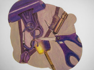
As a designer it is important to find things outside of yourself, to collect more references when creating the next design. It could be anything from nature to buildings to people or even the art tool box sitting right next to you.
For this particular oil pastel drawing the artist first came up with the overall idea of what is going to go on the paper, for example: color choice, composition, which objects to use, etc. The color choice the artist chose was purple with a complimentary yellow to balance out the colors. The objects are different sizes, never the same size with another object. All the different tools in the drawing flows well with one another. The complimentary colors were used at a 8 to 2 ratio (Purple to Yellow).

Many little things can spark a designer's imagination to think outside of him/herself. Not every designer may agree to the above statement, there is ALWAYS an argument against everything, but I must say this, "without inspirations there will be no design."

Drawing By: Joey Yao

Stone Soup

"Hangover"

Most of the time design is about teamwork. Working through compromises between everyone's ideas. Through the design process as a team, arguments are bound to appear, but the important thing is to know how to work around these arguments and come to a compromise between one and other.

Stone soup was a great example of designing with a team. Each group were limited to time and resources. Coming up with a design out of pine cones, branches, soda cans, etc. can be very difficult. Each member had to brainstorm ideas of what the procedures might be and at the end decide what to go forward with and what to leave behind. Sometimes less is more. Knowing when to stop is a great key to a successful design.

Communication plays a great role in teamwork. Good communication skills are bound to end in a great result. Even though each designer have their perspective on things, it is always good to listen to others' opinions because those opinions might influence them one day.

Monday, October 12, 2009

Andy Goldsworthy

Andy Goldsworthy

Many creators find inspirations outside of themselves. Andy Goldsworthy for example is one of the many great creators that uses outside elements from around nature to create his designs/artworks.

Andy Goldsworthy uses elements of nature as his medium of art. In this particular sculpture, the audience can see the composition of the rocks versus the tree branches in the middle. The placement of the tree branches in the hole flows outwards towards the borders on each side flowing the audiences' eyes to the rocks. Even though the rocks seem to box in the tree branches in the middle, it doesn't give a sense of too compressed, because the rocks are placed with spacial consideration; they are not placed too close to the border line giving off a sense of space.

Most designs we see today are represented by inspirations outside of the designers. Things they see, smell, feel, etc. can be put into their designs to make that connection with the audiences.

Image from: http://graememitchell.com/blog/andy-goldsworthys-sculpture

Ileona

Ileona

In this design, Ileona (Stand Up) by Phil Choo, the typography was based on the lyrics of a famous Korean song, Ileona. This design is different compared to his other designs in the exhibition. This piece contains only typography of Korean characters. The characters are in mainly two different sizes; the same phrase in each line is represented by having the characters standing up. There is a great sense of depth in this design, things closer to you are bigger and things farther away are smaller. Phil Choo also uses a different approach in this particular design. He uses a different perspective on the plane of the design.

The plane starts from the lower left corner and flows all the way up towards the upper right corner. Instead of having everything flat, he shapes the characters so that it appears to be on a curved surface. He also gave the Korean characters that are standing up cast shadows. This creates a sense of three-dimensional form to the whole design.

Sometimes a very simple design can be embellished with little things such as two/three point perspectives, cast shadows, etc. A design can actually come to life by just adding these simple elements.

Saturday, October 10, 2009

dream of a goose

Dream of a Goose

In this particular design, Phil Choo based the design on a popular Korean song called “Dream of a Goose”.


Phil Choo uses shapes and lines to create the figure of a goose, he didn't just draw out a goose, he used different shapes and colors to create a goose figure. He also uses typography to create lines and space around the goose. The typography in the design helps balance out the picture; it creates positive and negative space throughout the whole canvas. The typography ties the whole design together with the goose in the middle.

Compared to other designers, Phil Choo tends to base his designs on typography of Korean characters and non-recognizable shapes. After putting all the elements together, a goose comes out of the picture.

According to the lyrics to the song, the design is supposed to illustrate the idea of dreams intimidated by reality. “The goose in the middle implies that the big bird is flying over barriers.”

Design today tends to lean on simplicity and abstract drawings. Design evolved throughout time based on the interpretations of design from different generations. Many designers now involve typography art as part of their designs.

Thursday, October 8, 2009

hangul exhibition

hangul exhibition

When I first walked in to the Design Museum in Walker Hall, I’ve noticed the dimmed lighting and the dark blue walls all around. The lighting and choice of color on the walls made each artwork stand out to the audience. There was also a big divider towards the middle of the entrance, allowing viewers to walk around it and explore the artworks that were placed in the back.

As I walked around the museum, reading the signs next to the artworks, I’ve noticed many of the designs that were shown were based on Korean songs and traditional folk dances. Designers, Hyunju Lee and Phil Choo, mostly used typography as their main focus of each design. They both placed cultural songs and meanings of the songs into each design. From the design, even if we cannot understand the Korean characters, we can grasp the meaning behind each piece of design and what it meant to Hyunju Lee and Phil Choo.

Most of the time, designers will have designs based on things that influenced them from cultural backgrounds such as: family traditions, songs, religion, etc. These designs can be very appealing to the audience in our multicultural world today.